Friday, 12 December 2014

Case Study 6 (Film Poster 3)


Case Study 6

As a group, we liked the use of the shot being outdoors and decided we would like to be able to use the same kind of rooftop-looking setting. I like how the shot varies in using all the main characters in one shot as it can give the reader the interpretation that there should be at least one character that they may be able to relate to. I like how basic the format is with all the data, the title is clear and striking and the various data underneath. I personally like the layout in which the ratings and quote is at the top whilst everything else (including the title is at the bottom). It allows for a clear view of the image as well as making things not too complicated. I also like the position of the tagline as it leads straight onto the title. This is an idea that I will discuss with my group in terms of maybe coming up with our own.


Case Study 5 (Film Poster 2)


Case Study 5

The Starred Up film poster uses the Star Rating system, just like the review pages. It also includes quotes that help to depict the success of the film such as "O'Connell Is A Revelation" who I believe is the main character. The title is much larger than the other two film posters, this is a good straightforward approach in my opinion. The image also uses a darker type of colour scheme which relates effectively to the stroyline as we can see due to the jail setting behind the main character. It also uses a shot type that includes all of the main character, making him the primary focus


Case Study 4 (Film Poster 1)


Case Study 4

This film poster is unique compared to the others as it uses color whilst the others don't. The use of the color red specifically works well as it relates to the various themes of the film; anger, violence, blood and more. The title is also unique due to the fact that there is a figure standing within the "A", however it wouldn't work very effectively for our own film as it isn't as short and snappy as "SHANK". In class, we also discussed the idea of replicating the fading background image of the gang at the top using me and my brother.


Case Study 3 (Film Review 3)

Case Study 3

This review contains a page which uses an image on the top half and text on the lower. I like the use of this layout as it nice and simple, not too complicated for the audience. The title of the page is big bold font and is eye-catching to the reader. The image used consists of dark colors which suggests a suspense-type genre, i.e. action, thriller, horror. The review also utilizes the common "3 colors"to retain consistency as well as to keep layout simple and easy to view. Lastly, the review page includes elements such as star ratings, plot, and date. These are elements that I would like to use as they are common in a review page.


Case Study 2 (Film Review 2)


Case Study 2

This double-page spread is based on a film called The Seventh Son. The image appears to be a shot used in the film, similar to the idea we wanted to use for our review page(s). The use of lighting in the image is something I would like to replicate as it portrays the mood of the film, this would help us in the choosing of our review page image. The title uses a large font similar to the first case study so this is something that I would like to discuss as an idea with my group.The article also uses the common huge letter to indicate the start of the review. Once again, this an idea that I believe would benefit our group as it will help the layout and will reflect a realistic single-page review such as this one.


Case Study 1 (Film Review 1)


Case Study 1

On the right side of the dps, there is an alternate review for the film "The Conjuring", this review also does something different as it touches on past films developed by the producers/directors. As it is something different and unique, I believe we would like to incorporate this into our ideas as it would allow our magazine to be more independent and different. Similar to the previous Case Studies, specific shots are used to allow the audience to interpret the genre. This could also also work towards distinguishing the target audience and drawing in specific readers. There is a quote stated by the actors which is also something not many people would think of in terms of a review page. This is effective as it can be used to help portray the film in light of how the reviewer is trying to display his opinion on the film


Wednesday, 10 December 2014

Permission for Music


Permission

To avoid copyright issues, we had to email the owner of the song to ask permission for its use


Senseless - Potential Review Shots

Potential Shots

These are a list of potential shots that we are considering for the review page


Senseless - Inspiration Ideas

Inspiration Ideas

The main inspirations behind our film. We felt that these films relate a lot to ours in terms of what we were trying to produce and the impact we wanted to have on the target audience.


Tuesday, 9 December 2014

Filming (Second shooting)

Filming (Second shooting)

Some of the events from our second and final shooting, as you can see in the last two shots, we spent some time experimenting with different close-ups and angles.


Editing - Lighting Issue

Lighting Issue


We encountered a lighting issue with the sky on our first day of filming. This led to us having to change the settings of the camera to overcome the issue 

Friday, 5 December 2014

A2 Print products Pitch (Plan)

We have started planning for our A2 pitch and have already found sources we can use such such part of our inspiration which was "KiDULTHOOD" and "SHANK" in terms of the way it relates to our audience

Saturday, 15 November 2014

Recce - House


House - Recce


This is the Recce for our second location, the house of the main character

House - Recce

Wednesday, 5 November 2014

Backing Track Plan

Backing Track

We had various ideas on what backing track we should use. Eventually, we decided on not using any of them as we had found an even better track that flowed well with the film in terms of sync and emotion. 

Original songs: http://prezi.com/embed/epiafsgto7rt/?bgcolor=ffffff&lock_to_path=0&autoplay=0&autohide_ctrls=0&features=undefined&token=undefined&disabled_features=undefined

New song: https://www.youtube.com/watch?v=C9haTFoGcvk

Saturday, 25 October 2014

Change of location

Our first option for the park scene was Prince Regents Canal, however, we realised filming there could become problematic. As our second option, we decided it would be the Olympic Park. We eventually went on to choose this as we found it more beneficial to us as a group.

Risk Assessment


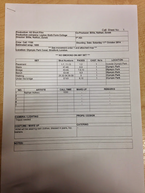
Call Sheet


Talent Release


Team Meeting


Thursday, 16 October 2014

Locations


Locations

Our group are planning to film in various locations such as the Olympic Park (which we have already got out of the way) as well as a house and alleyway scene which will be the next scene we film.


Storyboard


Storyboard

This is the storyboard we created within lesson that we will be using to give us some direction in terms of the shots we will use and how we are going to film the scene. After being advised that our storyboards should be more detailed as our previous one did not display too much depth, we came up with this one which was a great help on our first day of filming as we were able to manage our time effectively.


Filming (First shooting)


Filming (First shooting)

We began filming on a weekend (11th October). Things didn't go completely to plan as we ended up filming our other scene due to a misunderstanding. Aside from this, it turned out to be a productive day overall as we were able to film the scene without any major problems if not any at all. We were able to complete the scene and incorporate various shots such as wide-shots, close-ups, cutting action and more.